John Lewis Money Rebrand
Rebrand • Alert •
Rebrand • Alert •
Client: John Lewis Money
-
Rebrand of John Lewis Finance to tackle the following:
Drop in awareness
Alignment to parent brands
Inconsistencies in identity
-
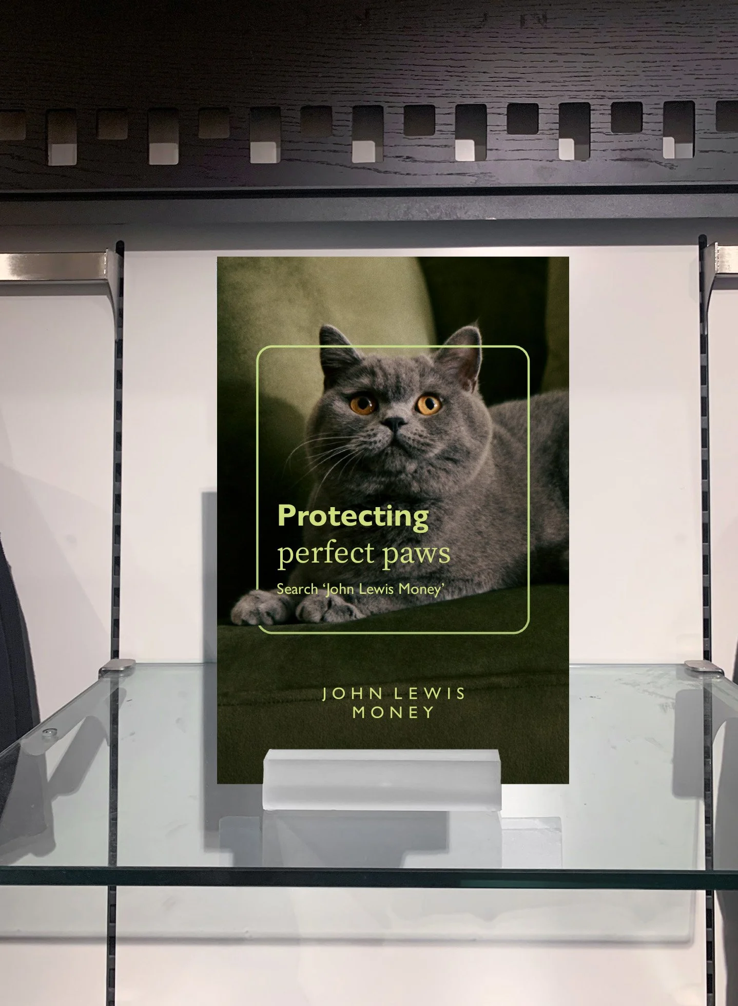
A new brand with a new name John Lewis Money. New vibrant hero colour and consistent approach to assets.
Our art direction approach was also aligned with John Lewis’ to make us more harmonious.
Old money
A snapshot of our old brand and identity. Depending on the product or campaign various verbal and visual tones were being used, resulting in a confusing landscape for customers.
Below there’s a snapshot of some social interactions, outlining how low awareness was for us.
new money
I arrived at the company halfway through the rebranding process with Pentagram. As the new Lead Designer at the then John Lewis Finance my job was to work with senior creatives on the John Lewis side, the Lead Designer at Pentagram and senior stakeholders from John Lewis Finance.
Together we reviewed the progress from Pentagram and shaped it into a solid identity. This was then translated into the hundreds of assets that make up the brand by the Lead Copywriter and I, with a lot of help from the retail team and the designers and writers in our studio.
OLD
Bau
NEW
Guides
Motion
An absolutely massive project, kicking off a year before I joined and launching a year after. We ploughed through hundreds of assets and danced around even more amends. It was an amazing, testing but ultimately hugely rewarding experience.
It was so well received across the business and externally (over the first 4 months) it saw a 2% increase in prompted and unprompted awareness and an NPS (Net Promoter Score) jump of 8pts.


